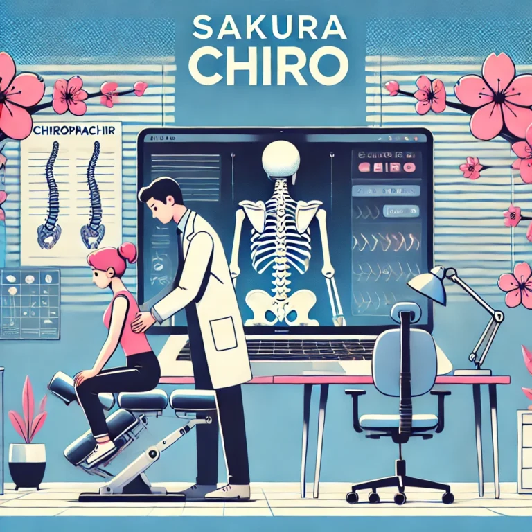
The best chiropractic website features in 2026 do more than look professional. They help nearby patients find your practice, understand your services, trust your team, and book an appointment with less friction. Specialized service lines such as neuropathy care benefit from dedicated marketing pages too. If you would like hands-on care, you can book a visit with Sakura Chiropractic.
A website is no longer just a digital brochure. It should work as a patient acquisition system that combines mobile-first design, local SEO, service pages, online scheduling, patient reviews, fast page speed, conversion tracking, and patient communication tools.
Most patients do not visit a chiropractic website to browse. They are usually trying to solve a specific problem. They may be searching for back pain treatment, neck pain relief, sciatica care, auto accident chiropractic care, sports injury treatment, spinal decompression, or a chiropractor near them with convenient appointment options.
That is why the best chiropractic websites are built around patient intent. They quickly answer the questions a patient is really asking: Can this chiropractor help with my problem? Is the office nearby? Does the practice look trustworthy? What do other patients say? Can I book, call, or message easily? And what happens next?
What Makes a Chiropractic Website Work in 2026
The best chiropractic website is fast, mobile-friendly, locally optimized, easy to navigate, and built to convert visitors into booked patients.
In practice, that comes down to a core set of features working together: clear appointment buttons, strong service and condition pages, patient reviews, local SEO signals, online scheduling, real practice photos, insurance information, provider bios, conversion tracking, and connected patient communication tools.
The goal of all of it is the same. A chiropractic website should not only educate visitors. It should help patients take action. The sections below break down the features that matter most, especially for practices that want more visibility, more appointment requests, and a better patient experience.

1. Mobile-First Design
Most chiropractic patients search from their phones. Someone looking for a chiropractor may be in pain, on a lunch break, sitting in a car, comparing local options, or trying to book quickly before symptoms get worse. That makes mobile-first design one of the most important features of any chiropractic website. We cover this further in top SEO agencies for chiropractors.
On mobile, patients should be able to call the office, book an appointment, read reviews, check hours, find directions, view services, and send a message without effort. If a patient has to zoom in, scroll endlessly, or hunt for your phone number, the site is creating friction, and friction is where appointments vanish.
A strong mobile chiropractic website includes a sticky call button, a visible appointment button, fast-loading pages, large readable text, simple navigation, and tap-friendly forms.
2. Clear Appointment Calls to Action
The best chiropractic website makes the next step obvious. Every major page should include a clear call to action, whether that is booking an appointment, calling the office, requesting a consultation, scheduling online, or sending a message.
Place the main appointment button near the top of the page, again throughout longer pages, and once more near the bottom. On mobile, the call or booking button should be especially easy to use.
Many chiropractic websites lose potential patients because the site looks nice but does not guide the visitor. A patient should never wonder what to do next. Use calls to action as signposts that guide the visitor from interest to action.
3. Service Pages Built Around Patient Search Intent
A single generic services page is not enough for most chiropractic practices. Patients search for specific problems, not broad website categories, so your site should include dedicated pages for the services, symptoms, and conditions people actually search for.
Useful pages cover back pain, neck pain, sciatica, auto accident care, sports injuries, headaches and migraines, whiplash, spinal decompression, chiropractic adjustment, corrective care, posture correction, and wellness care. Prenatal and pediatric chiropractic pages are worth adding too, if you offer them.
Each page should explain the problem, how your practice approaches care, what patients can expect, and how to book. The relationship is simple: service pages match patient search intent, that intent supports local SEO, and local SEO creates more appointment opportunities. You can also explore neuropathy marketing.
The best chiropractic websites do not just say “we offer chiropractic care.” They explain exactly how the practice helps patients with back pain, neck pain, sciatica, headaches, injuries, mobility issues, and everyday discomfort.
4. Local SEO Signals
A chiropractic website should make it clear where the practice is located and who it serves. Local SEO helps you appear when nearby patients search for terms like “best chiropractor near me,” “chiropractor in [city],” “back pain chiropractor in [city],” “sciatica chiropractor in [city],” or “auto accident chiropractor near me.”
Build those signals naturally into your important pages. That includes your city and neighborhood in page titles, a consistent name, address, and phone number, a detailed contact page with office hours and an embedded Google Map, nearby landmarks and driving directions, and location-specific service pages. If you have multiple offices, give each one its own page and link between services and locations.
Keep it natural. Repeating “chiropractor in [city]” in every sentence makes the page sound stiff and untrustworthy. Write clearly for patients while making your location obvious to search engines, like this: “Our chiropractic clinic serves patients in Austin and nearby communities who are looking for help with back pain, neck pain, sciatica, headaches, sports injuries, and mobility concerns.” That sentence is useful, local, and readable.
5. A Homepage That Positions the Practice Clearly
Your homepage should immediately explain who you help, where you are located, what you offer, and how patients can take the next step. The strongest homepages include a clear headline, your city or service area, your main services, a short explanation of your approach, patient reviews, doctor or team photos, appointment buttons, insurance or payment information, links to key service pages, and a location section.
Your homepage should not try to say everything. Its job is to orient the patient and guide them to the right next step. A headline like “Chiropractic care in [City] for back pain, neck pain, sciatica, sports injuries, and everyday mobility” is clear for patients and useful for search engines. See our related breakdown of landing pages for chiropractic Google Ads.
The best chiropractic homepage is not overloaded with vague promises. It is direct, local, and action-oriented.

6. Patient Reviews and Social Proof
Reviews are one of the fastest ways to build trust. When someone is choosing a chiropractor, they want proof that other patients had a positive experience, so your site should make reviews easy to see rather than hiding them on a page nobody visits.
Place reviews where they reinforce decisions: in a homepage review section, as testimonials on service and location pages, near booking sections and appointment buttons, and on a dedicated reviews page. Short review snippets next to a call-to-action are especially effective.
Reviews help patients feel more confident before calling or booking, and they strengthen credibility when paired with real photos, provider bios, and clear service information. Keep them real, specific, and compliant. Avoid fake reviews, copied testimonials, exaggerated claims, or anything that implies guaranteed outcomes. Trust is powerful, but it needs clean hands.

7. Real Photos of the Practice
Stock photos can make a chiropractic website look polished, but real photos build more trust. Patients want to know what the clinic feels like before they visit, so show the chiropractor, the care team, the front desk, the waiting area, the treatment rooms, and the exterior of the office, plus equipment where it is relevant.
Real images reduce uncertainty and make the practice feel more human, more local, and more credible. The best chiropractic websites use visuals to answer an unspoken patient question: “Will I feel comfortable going here?”
8. Fast Page Speed and a Clean Experience
A slow chiropractic website can lose patients before they ever read your content. Patients searching for care often compare several local practices at once, so if your site loads slowly, shifts around on the screen, or feels clunky on mobile, visitors may leave and call another office. For the full picture, visit our piece on a high converting chiropractic homepage.
Build for fast loading, smooth interaction, and a stable layout, with compressed images, clean design, minimal plugin bloat, and a simple page structure. Good design is not just about looking modern. It is about helping people move through the site easily. The best chiropractic websites feel clean, quick, and calm, and they never make the visitor fight the interface.
9. Online Scheduling or Appointment Request Forms
In 2026, many patients expect a simple way to request or schedule an appointment online. A strong chiropractic website makes booking easy with online scheduling, appointment request forms, click-to-call buttons, text or message options, and clear next-step instructions.
The goal is to reduce friction. A patient who is ready to book should not have to dig through five pages to find a contact option. Keep forms short, asking only for essentials like name, phone number, email, preferred appointment time, and a brief reason for the visit. If more detailed health information is needed, handle it through appropriate patient intake and communication workflows.
10. Patient Communication Integration
A website is only the beginning of the patient journey. After a patient submits a form, calls the office, or requests an appointment, the practice still needs to follow up, answer questions, confirm details, send reminders, and keep the patient engaged. This is where patient communication tools matter.
A high-performing chiropractic website should connect with workflows like appointment reminders, patient messaging, online scheduling, review requests, recall campaigns, follow-up communication, reputation management, and missed-call follow-up.
This matters because many patients do not book after one interaction. They may compare reviews, check insurance, ask a question, or need a reminder before confirming. When your website connects with patient communication tools, your practice creates a smoother path from website visitor to booked appointment.
11. Insurance and Payment Information
Insurance and cost questions often stop patients from booking. If a visitor cannot tell whether your clinic accepts their insurance or offers self-pay options, they may leave without contacting you. Learn more in our article on Google Tag Manager for chiropractors.
A helpful insurance and payment page can explain accepted insurance plans, self-pay options, new patient visit information, what to bring, how insurance verification works, any payment plans, and whether the office can answer coverage questions before the first visit.
You do not need to answer every financial question online, especially since coverage varies. But you should reduce uncertainty enough for patients to take the next step. Clear insurance and payment information supports conversion because it removes a common booking barrier.

12. Provider Bios That Build Trust
A chiropractor bio should not be a thin afterthought. Patients want to know who will be treating them, including the provider’s experience, style, and approach to care.
A strong bio includes education, licenses, years of experience, clinical interests, conditions commonly treated, care philosophy, a professional photo, and a few relevant personal details. The best provider bios are professional but human. They help the patient feel that this person seems qualified, approachable, and aligned with what they need.
Bios can also support SEO when they naturally include relevant services, conditions, and location details.
13. Condition-Based Content
Many patients do not search for “chiropractic adjustment.” They search for the symptom or problem they are experiencing. That is why condition-based content is one of the most valuable chiropractic website features.
Useful condition pages cover back pain, lower back pain, neck pain, sciatica, whiplash, headaches, shoulder pain, hip pain, poor posture, pinched nerve symptoms, sports injuries, and auto accident injuries.
Each page should be helpful, careful, and easy to understand. A strong structure explains what the condition may feel like, common causes, when to seek care, how your practice evaluates the issue, how chiropractic care may fit into the plan, what to expect at the first visit, and how to book. Avoid guaranteed outcome claims. The goal is to educate, build trust, and help the patient decide whether your clinic may be a good fit.
14. Simple Navigation
The best chiropractic websites are easy to use. A clean navigation menu usually includes Home, About, Services, Conditions, Reviews, Insurance, Contact, and Book Now.
Patients should not have to decode your website. Navigation should guide them clearly and calmly. Too many menu items create confusion, and too few can bury important pages. The best structure is simple: show patients where to learn, where to build trust, and where to book. To go deeper, read our guide on schema markup for chiropractic websites.
15. FAQ Sections That Match Real Patient Questions
FAQ sections are useful for both patients and SEO. Strong chiropractic FAQs answer questions like how to know if you need a chiropractor, what happens during the first visit, whether chiropractors treat sciatica, whether insurance covers care, how much a visit costs, how many visits are typical, whether you can book online, and whether the practice treats auto accident injuries or offers same-day appointments.
FAQs help reduce hesitation. They also capture long-tail search intent and give search engines clearer context about your services. The best chiropractic website does not leave common questions unanswered. It handles them directly, in plain language.
16. Conversion Tracking
A chiropractic website should be measurable. If you do not track conversions, it is hard to know whether your website is actually producing new patient opportunities.
Track the actions that signal intent: phone clicks, appointment form submissions, online booking clicks, contact page visits, directions clicks, text message clicks, and review interactions. This shows which pages generate calls, which services attract interest, and where patients drop off.
Tracking is especially important if your practice invests in SEO, paid ads, or social media. A good website should not just look busy. It should show what is working.
17. HIPAA-Conscious Forms and Communication
Chiropractic websites should be careful with patient information. General website forms should avoid collecting unnecessary health details unless they connect to appropriate secure systems and workflows.
A safer approach is to keep general forms simple and route sensitive information through proper patient intake or communication tools. A basic appointment request form might ask only for name, phone number, email, preferred appointment time, a general reason for the visit, and consent to be contacted. For detailed health history, insurance documents, or clinical intake, use secure healthcare workflows.
The best chiropractic website makes it easy for patients to reach out while respecting privacy and patient communication standards.
18. Review Generation and Reputation Management
The best chiropractic website is connected to the practice’s reputation strategy. Reviews improve trust, support local visibility, and increase conversion rates, but review growth should be handled ethically and consistently. We cover this further in how to market chiropractic services.
A strong reputation system helps you request reviews after visits, monitor new reviews, respond to feedback, identify patient experience issues, and showcase reviews on the website. For chiropractors, reviews often influence the first call. If two practices look similar, the one with stronger reviews and clearer social proof usually has the advantage. Treat reviews as part of the conversion system, not decoration.
19. Structured Data and Technical SEO
A chiropractic website should be easy for both patients and search engines to understand. Helpful technical elements include schema markup such as LocalBusiness and Organization schema, FAQ and review schema where appropriate, breadcrumbs, optimized title tags and meta descriptions, clean URLs, an XML sitemap, internal links, and fast hosting.
Technical SEO is not always visible to patients, but it helps search engines interpret your practice, services, location, and content. The best chiropractic websites combine strong content with clean technical structure.

20. A Connected Marketing System
A website alone is not enough. The best chiropractic website in 2026 works as part of a connected growth system that may include local SEO, Google Business Profile optimization, online reviews, paid search, social media, email communication, text reminders, patient recall, online scheduling, reputation management, and conversion tracking.
For years, many practices hired separate vendors for web design, SEO, paid ads, reviews, and communication. That often created inconsistent messaging, higher costs, and unclear accountability.
A more effective approach is to connect the website with the workflows that help patients find the practice, book an appointment, show up, return, and leave feedback. That is where website design becomes practice growth.
Connect Your Website to the Tools That Convert Patients
A chiropractic website works best when it connects to the tools that help patients take action. Communication, scheduling, reminders, reputation management, and marketing workflows all reduce friction before and after the visit.
This matters because a new patient may not book after one website visit. They may compare reviews, check hours, look for insurance information, send a message, or need a reminder before confirming. When your website and patient communication tools work together, your practice creates a smoother path from first search to booked visit.
A strong chiropractic website attracts the visitor. Your scheduling, reminder, and reputation tools support what happens next.
Chiropractic Website Feature Checklist for 2026
Use this checklist to evaluate your current website. If several of these features are missing, your site may look fine but still underperform.
Design and UX
- Is the site fast on mobile, with a clean, professional, current design?
- Is the navigation simple and the text easy to read?
- Are buttons easy to tap, and does the site feel trustworthy?
Conversion
- Is the phone number visible and the appointment button easy to find?
- Can patients book, call, or message quickly, with simple forms?
- Are calls to action repeated on key pages, and are online scheduling options clear?
SEO
- Does the homepage mention your city or service area?
- Do you have dedicated service pages and condition pages for high-intent searches like back pain, neck pain, and sciatica?
- Is your name, address, and phone number consistent, and does your contact page include a map?
- Do your title tags and headings describe each page clearly, with internal links between related pages?
Trust
- Do you show patient reviews, real practice photos, and strong provider bios?
- Do you explain insurance and payment options and show credentials and experience?
- Does the site feel personal to your practice?
Patient Journey
- Does the website connect to appointment workflows, with clear next steps after contact?
- Are review requests part of your process, and do communication tools support follow-up?
- Can you track calls and form submissions, with marketing, scheduling, and reputation systems aligned?
Common Chiropractic Website Mistakes to Avoid
Even well-designed chiropractic websites can lose patients if they miss the basics.
Hiding the appointment button. If new patient growth is the goal, the appointment button should never be hard to find.
Using only generic stock photos. Stock images can look polished, but real practice photos build more trust.
Having one thin services page. A single services page is rarely enough to rank for high-intent searches like back pain, sciatica, neck pain, and auto injury care.
Ignoring reviews. Patient reviews are one of the strongest trust signals on a chiropractic website. If they are missing, the site feels less credible.
Writing only for search engines. SEO matters, but patients come first. A page that sounds robotic, repetitive, or vague tends to rank poorly and convert even worse.
Treating the website as separate from operations. A website should support scheduling, communication, reminders, reviews, and follow-up. When those systems are disconnected, patients feel the friction.
What the Best Chiropractic Website Looks Like in Practice
The best chiropractic website is not the one with the most animations, the longest pages, or the trendiest design. It is the one that makes the patient’s decision easier.
A strong site tells patients, in effect: you are in the right place, we treat the problem you are searching for, our clinic is nearby, other patients trust us, booking is simple, and here is what happens next. That is what turns a website from a digital business card into a growth asset.
Final Thoughts: Build a Website That Books Patients
The best chiropractic website in 2026 is not just a nice-looking site. It is a conversion-focused, locally optimized, mobile-first patient acquisition system. It should help patients find your practice, trust your team, understand your services, and book an appointment with less friction.
The most important features are clear calls to action, strong service pages, local SEO, patient reviews, fast mobile performance, online scheduling, insurance information, provider trust signals, conversion tracking, and connected patient communication tools. When those pieces work together, your website becomes more than a brochure. It becomes a reliable part of your practice growth system.
If your current website looks good but does not bring in enough new patient opportunities, start with the biggest wins first: mobile calls to action, service pages, reviews, local SEO, and simple booking paths. From there, connect your website to stronger scheduling, reminders, and reputation tools to create a smoother path from website visitor to booked appointment.